- TOP >>
- The Yoshinodo Story >>
- Hiyo Hiyo Hiyoko
It would not be a stretch to say that the many decisions made in 1964, when Hiyoko came to Tokyo, were what made Hiyoko what it is today. One of those decisions involved font changes. The original font was in a writing style called Hige-moji, a traditional and more masculine writing style befitting a Kyushu boy, but we needed to make the font more fashionable and in sync with the times.
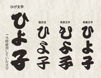
Hige-moji
Together with Kanteiryu, Yose-moji, and Sumo-moji, Hige-moji is one of the Edo-moji writing styles in which the flick of the brush and pullout stroke is grazed across the page for an appearance that resembles hige (whiskers or facial hair). The numbers 3, 5, and 7 carry superstitions that are connected with this writing style.
Kanteiryu
This style of writing is used in billboards and signs for Rakugo (comedic storytelling) and Kabuki (traditional theater).
Yose-moji
This style of writing is used to catch the eyes of patrons. Based on both Kanryutei and Chochin-moji (used on paper lanterns), it is used for flyers and senjafuda (paper tags posted at the gates of temples and shrines).
Sumo-moji
This familiar script is used in sumo-related lettering for media such as advertisements or board displays.
At the time, Shunso Machi was gaining popularity as a young female calligrapher. We had no idea what kind of script would result when we asked her to create the Hiyoko lettering for us. We awaited the result anxiously and with high expectations.
Then, when she came to us with the four styles shown above we were absolutely amazed. We loved them and instantly knew we had a winner.
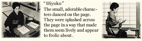
She demonstrated an incomparable combination of design sense and the ability to make people feel emotional.
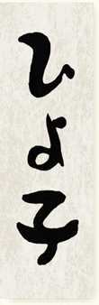
When we moved into Tokyo, we used this lettering style for logos as we developed our business with a new image. The lettering was used in all media, including television commercials, newspaper advertisements, and store-front displays. It became our visual identity.
We were very fortune to have Hiyoko’s popularity explode in Tokyo. It was especially popular with people from Tohoku who purchased souvenirs at Ueno station.
The development of a unified design based upon the characters for Hiyoko also became the talk of the industry. With the tremendous Japanese economic boom in the 1960’s, sweets companies vigorously pursued new designs, and new products with fresh and original designs poured into the market, further invigorating the market place itself.
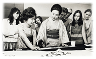
Profile: Shunso Machi
Born in 1922, she held her first exhibition in Tokyo’s Ginza area in 1953. At that time, calligraphers were usually thought of as male, solemn in appearance, and painting difficult characters with vivid ink. Shunso was nothing like this. She was a young, beautiful female calligrapher who looked lovely in traditional Japanese attire. She was always taking on new and different challenges, such as collaborative projects involving nursery rhymes, poems, and paintings. She even strove to make Japanese calligraphy more international. In 1985, she won the French cultural award, the Ordre des Arts et des Lettres (Order of Arts and Letters), and was honored with the Shijuhosho Purple Ribbon Medal (the Forth Order of Merit) in 1995, before she passed away.